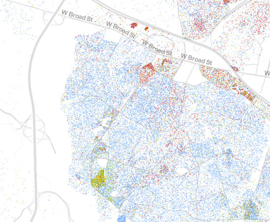
Does anything stand out to you on this map?

Three areas jump out at me:
- the dark green/yellow/red area in the lower left
- the bright red “arrow” shape in the upper center
- the heavy red/blue/green mix under “W Broad St” on the right
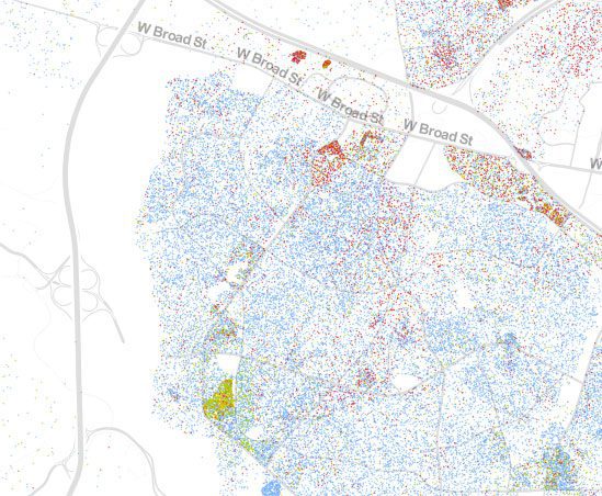
Each dot on this map represents 1 person, and each color represents their race: green represents black, orange represents Hispanic, blue represents white and red represents Asian.
These three neighborhoods jump out because they are pockets of diversity in an otherwise similar region.
Think about how much culture is represented in those three neighborhoods. Think about the richness they can share with the surrounding community. Knowing the people I know in each of those neighborhoods, they do have a lot to share.
But truth be told, I don’t know everyone in these neighborhoods. I really don’t know more than one or two families. Our community, and your community, would be a lot stronger if we got to know these families. They might not be like us, but that’s what makes us stronger.
Like I wrote in I Hate Suburbia, this is my home, my neighborhood, my community. I should care more about it. What about you?
Take a look at your community on the Dot Map at CooperCenter.org, produced by The Cooper Center for Public Policy at the University of Virginia.


Next Level Justice